Revamping the “List Of Likes” page and experience.

Revamping the "List Of Likes" page and experience

Revamping the “List Of Likes” page and experience.

We were briefed by Paul-Antoine Campos, Head of Product Design at Happn on this major problematic they never worked on.

11% of negative reviews
concerning the List of Likes

46% of the DAUs go to
the List of Likes.

Context

What do we need to explore ?

The List of Likes (LOL) is one of the first Premium feature integrated into the application but has not much evolved since.
On Happn, every “Like” is secret until you like back.
So to discover who fancies you, you need to go Premium.
The first reason of male users to upgrade their plan, is for the revelation of the List Of Likes.
Despite this, the 'LOL' constitutes 11% of negative reviews on different app stores.

THE CHALLENGE

How to increase the conversion rate from the "List Of Likes" by 25%

THE CHALLENGE

How to increase the conversion rate from the "List Of Likes" by 25%

THE CHALLENGE

How to increase the conversion rate from the "List Of Likes" by 25%

OUR GOALS

01

Increase conversion

02

Increase retention

03

Increase number of time

01

Increase conversion

02

Increase retention

03

Increase number of time

01

Increase conversion

02

Increase retention

03

Increase number of time

Benchmark

An eye at the market

While exploring dating apps, we noticed that they share many similarities, both in terms of economic models and certains flows.

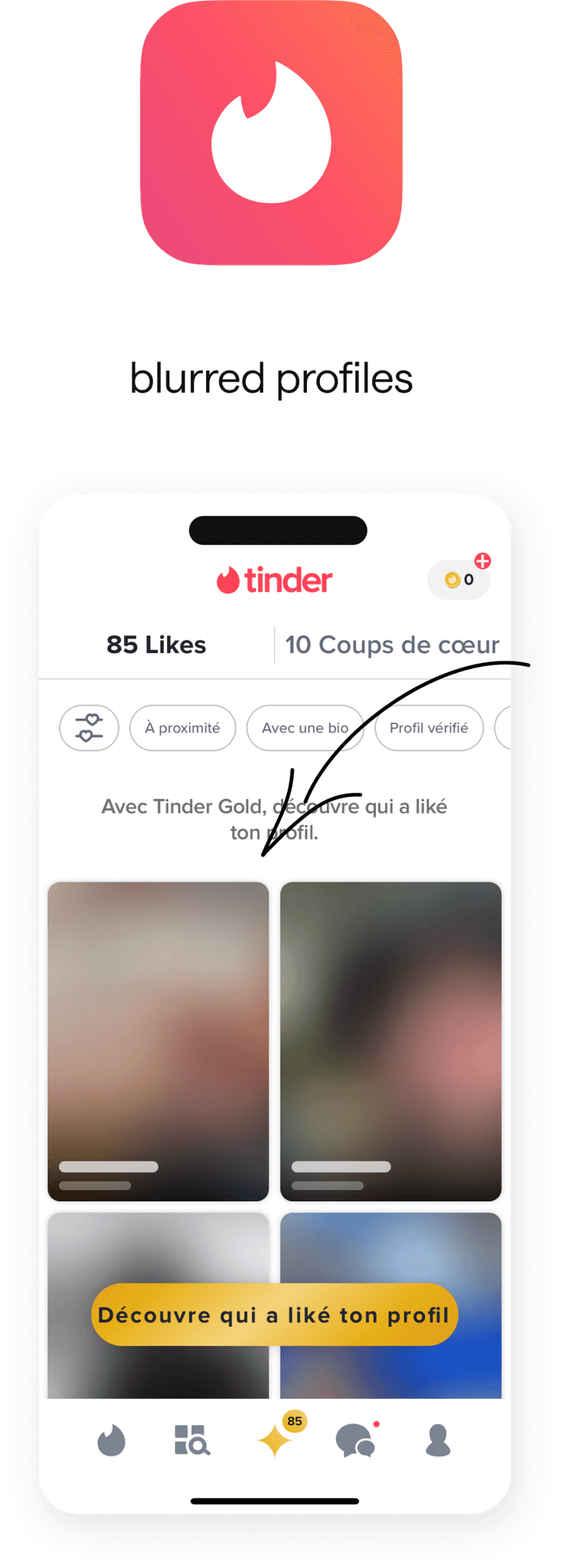
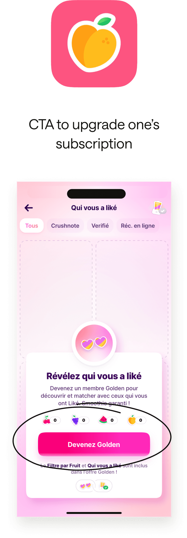
Most "LOL" share the same noticeables features

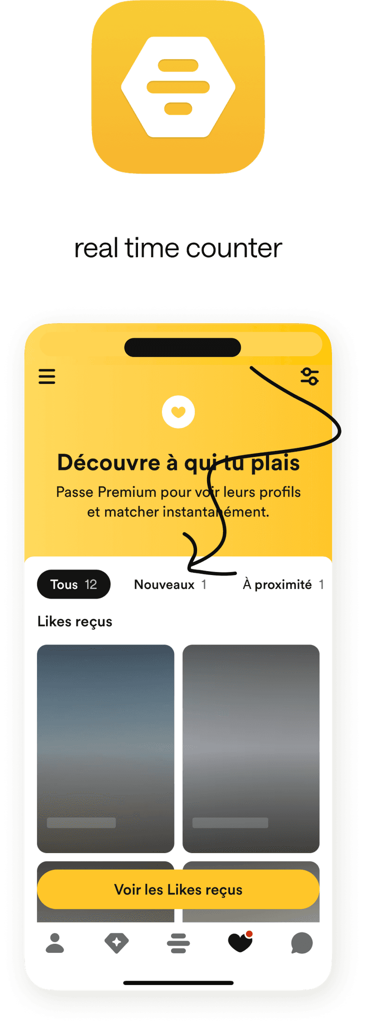
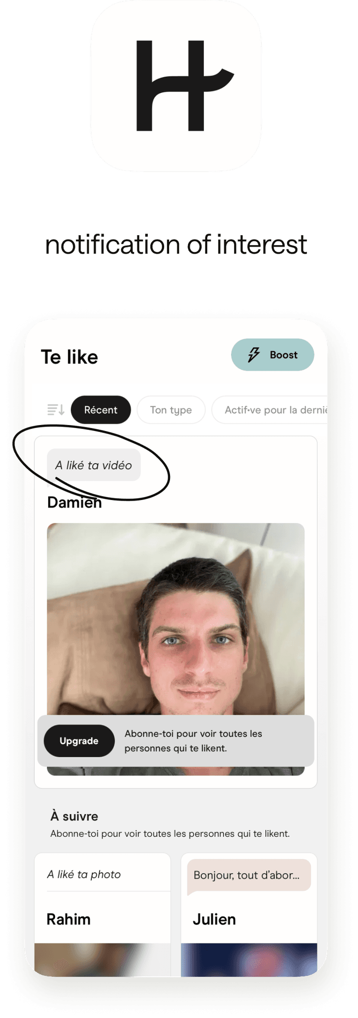
However, Happn's list of Like is less comprehensive than its competitors

Our benchmark

HELLO VISITOR, I'm AN EASTER EGG

Our benchmark

HELLO VISITOR, I'm AN EASTER EGG

Our benchmark

HELLO VISITOR, I'm AN EASTER EGG

User Research

Interviewing Users

The interview panel consisted of 3 men and 1 woman, aged between 24 and 36y/o, all with prior or actual use of dating apps.

Camille, 32

Xabiere, 36
Maxime, 32

Sacha, 24

Interviews panel

Objectives :

Understanding how users perceive the LOL page.

Understanding how users perceive the LOL page.

Understanding how users perceive the LOL page.

Identifying what holds them back from upgrading to Premium mode.

Identifying what holds them back from upgrading to Premium mode.

Identifying what holds them back from upgrading to Premium mode.

Determining various feelings regarding dating apps.

Modalities

Interviews

Video Calls

75%

25%

24-36 y/o

5 peoples

Semi guided interviews

What we've learned

  • Users don't perceive the Premium subscription positively.

    “Transitioning from free to paid ? I don't see a significant difference in features”

    Sacha
  • Users express regret that the apps are primarily based on physical appearance.

    "Too bad that on these apps, personal interests come second after physical appearance."

    Xabiere

  • Users don't see unlocking their List Of Likes as useful.

    “Rather than shifting from a degraded mode to a correct one, I would pay for additional features and quality.”

    Maxime

Learnings from our user's interviews

Problematic

How can we promise a deeper connexion with an enhanced experience on the LOL ?

How can we promise a deeper connexion with an enhanced experience on the LOL ?

How can we promise a deeper connexion with an enhanced experience on the LOL ?

Metrics to impact : +25% conversion rate on LoL, DAU & time spent on page.

IDEATION

Helping users to meet someone really close to them !

We began the ideation process by first creating a MindMap to understand what Happn evoked and everything that encompasses the application.

We need to reinvest the application through the initial proposition of Happn to make stories

Then, we conducted a Crazy 8 where initial ideas for solutions emerged.

Localized Match

To find people closer in every way

Reassure
To restore confidence in the premium offer.

Focus
To shift the focus of encounters away from physical appearance.

We need to reinvest the application through the initial proposition of Happn to make stories

Then, we conducted a Crazy 8 where initial ideas for solutions emerged.

Solution

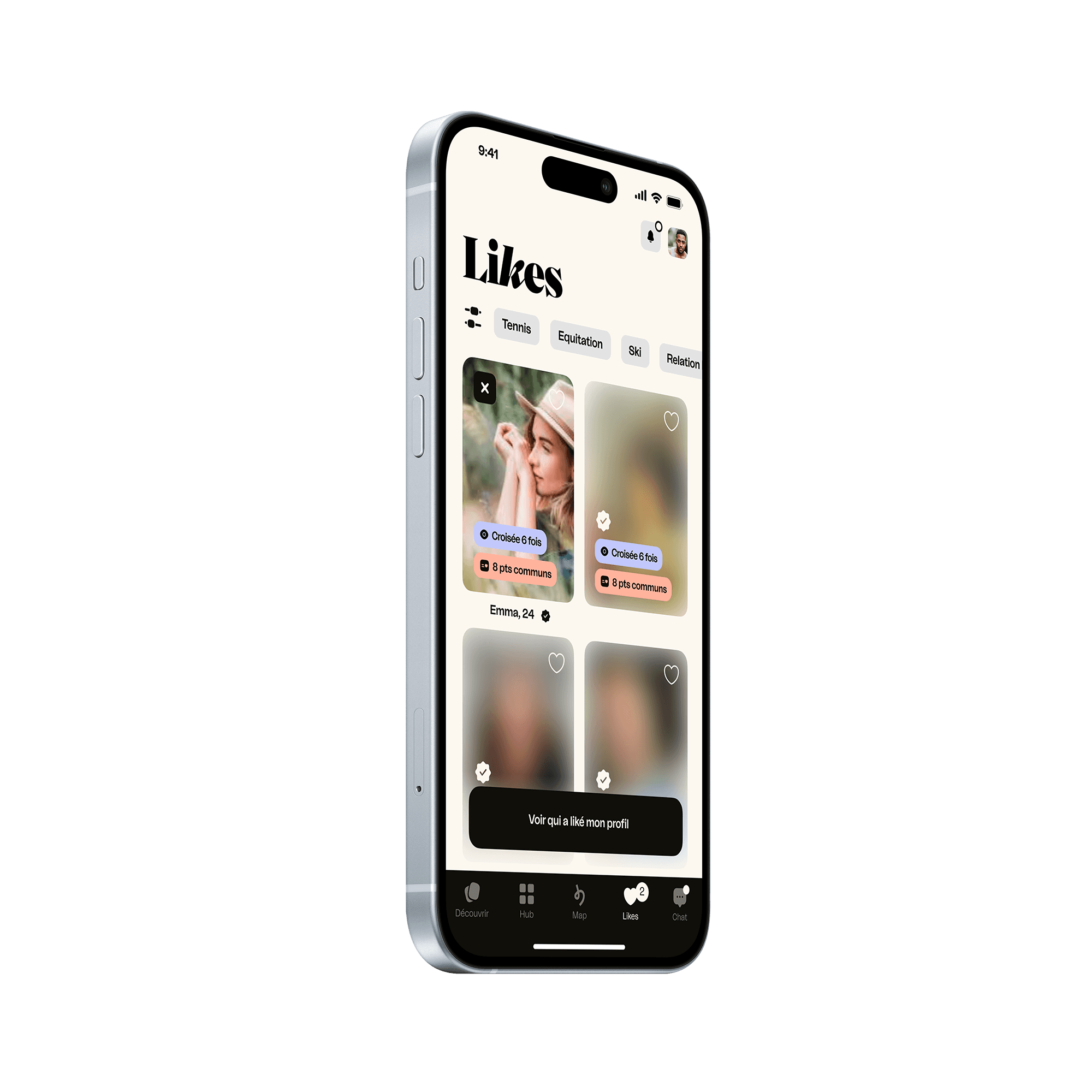
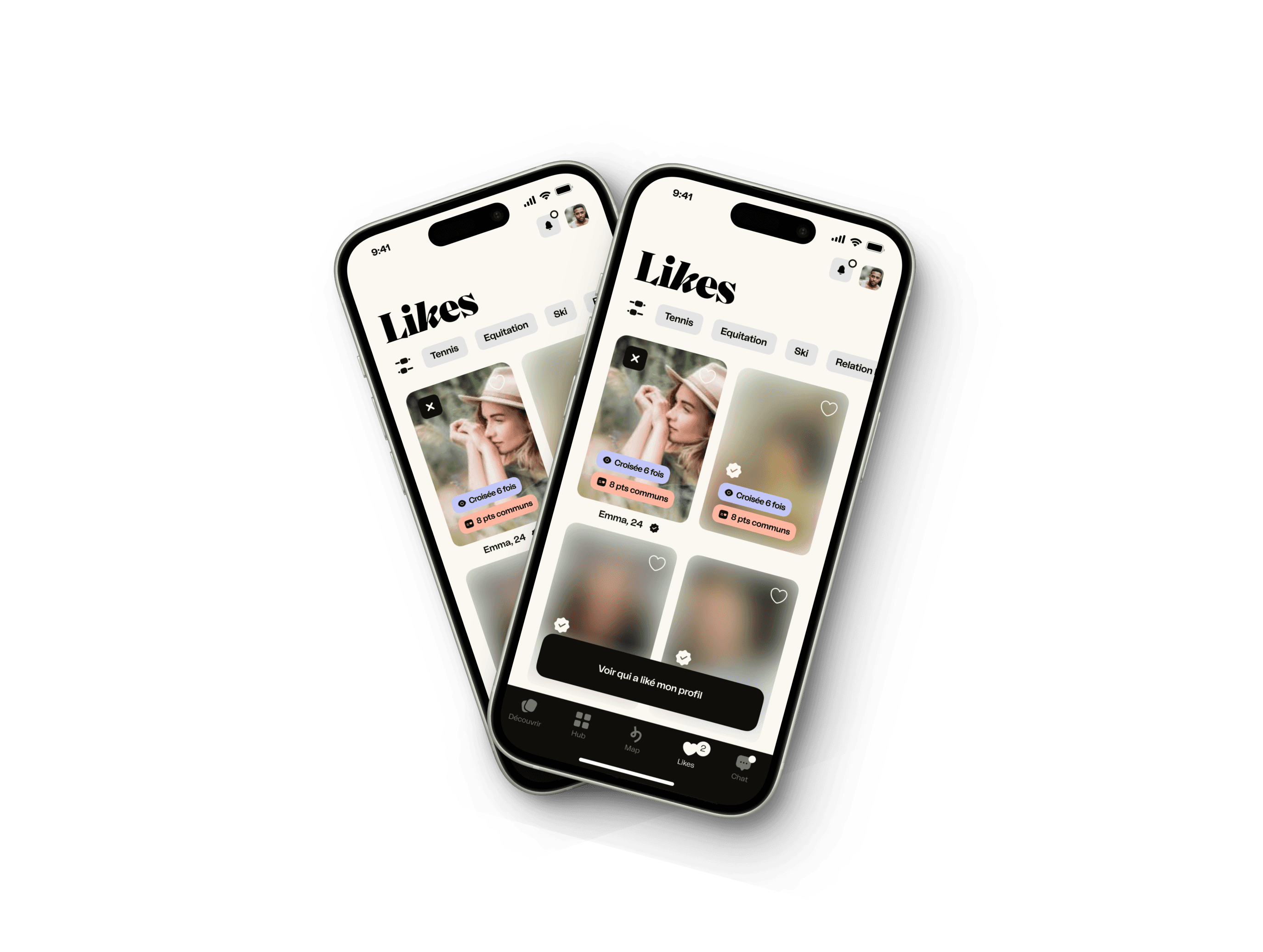
Rethinking LOL's UI design

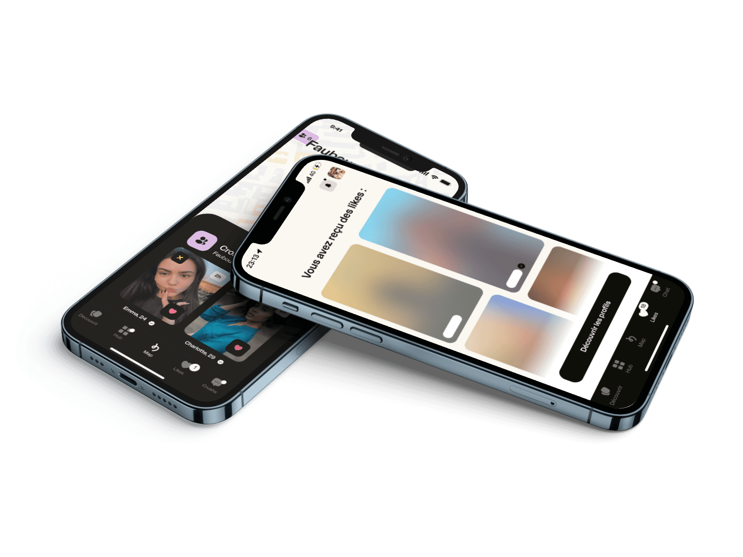
We completely redesigned the LOL page :

  • On-brand UI. A more distinct look and feel, make it more identifiable for users.

  • Pubtile blur on photos to create teasing personalized filters to classify your crushes. Visible for everyone, usable on Premium.

  • new entry for Crush Time.

Video of our first solution

Making the map a new entry point to the LOL

On the map page, you can find all the places visited and the count of users encountered there.
We added :

  • A button to find your crushes

  • Clicking on a crush will lead to the LOL.

Video of our second improvement

Adding common interest on LOL's crush cards.

We added a few elements to the blurred card to increase user's frustration and curiosity

  • Highlighting common interests with a title and a color code.

  • Adding additional common points to help users establish a real connection beyond visual appearance.

  • Encourage users with the creation of a gift card to offer users to the Premium boosts if they complete their profile at 100%.

Video of our third solution

User TESTS

Testing our improvements

In order to test our solutions we carried out User Tests, then we iterated following the test's results

Our panel was made of :

  • 6 dating app users

  • 6 male from 24 to 36 y/o

Cyrille, 32

Théo, 33

Xabiere, 36

Maxime, 32

Sacha, 24

User test's panel

Objectives :

Verify the acceptance of the LOL's new UI.

Asses the added value of the new features.

Check the affordability of our new feature.

Mesure user's confidence in the Premium mode.

1.
Rethinking LOL's UI design

Rethinking LOL's UI design

The widespread use of LOL creates a habit of users skipping this page. Therefore, we decided to show the photo of the first match to embody it and enhance the teasing.

  • 5 out of 5 users appreciate the filters on LOL as it sparks new curiosity for profiles.

  • 5 out of 5 users don't really stop on LOL, neither interact nor identify the page as an advertisement.

To place more emphasis on LOL and Crushes, we removed the entry point to Crush Time, lightening the overall experience.

2.
Making the map a new entry point to the LOL

Making the map a new entry point to the LOL

We improved the interaction and made transitioning to encountered people to LOL more intuitive.

  • 4 out of 5 users don't differentiate between LOL and encountered people through common interests

The 2 buttons becomes one, a slider allows users to slide between encountered people and crushes.

3.
Adding common interests on LOL's crush cards

Adding common interests on LOL's crush cards

We had to take a few step back with the color code, as our improvements was to much information.

  • 3 out of 5 users don't understand the color code for common interests and confuse the pill

  • 4 out of 5 users feel more curious with common interests on the blurred profiles.

Conclusion

To go further

This project was very challenging because users are in a love hate relationship with the product, so convincing them to switch to Premium mode was quite a deal.
I learned that the more frustrated users are, the faster they navigate.

Considering that we might iterate again, we could try an approach more focused on gamification.

Vichat © 2023 All right reserved.

Merci bisous !